

Sweet Tooth
“Search for your dessert”

Roles
UX Research
UX Design
Team (5)
Yarisel
Valeria
Sana
Sean
Beth
Timeline
Overall: March 2023 - April 2023
Discovery & Research: 2 weeks
Design & Testing: 3 weeks
Tools
Figma
Google Forms
Trello
Miro
🍰 My Sweet Tooth A Personal Design Challenge
Managing blood sugar levels can be challenging, especially for someone like me who loves sweets! When I discovered I was pre-diabetic, I embarked on a journey to prioritize my health while still enjoying the desserts I adore. As part of a four-member design team, I poured my heart and soul into developing Sweet Tooth, a mobile application catering to individuals with diverse dietary needs.

Problem
Many people struggle to find delicious treats that fit their dietary needs, whether it's due to health reasons like diabetes or personal choices like veganism or vegetarianism. The limited availability of desserts catering to these requirements often leaves individuals feeling dissatisfied and disheartened. This problem makes it challenging for people to indulge in sweets without compromising their well-being.

Goal
Our mission is to create an app that connects individuals with personalized dessert options from local bakeries. We aim to revolutionize the culinary experience for people with dietary restrictions, helping them enjoy sweet treats without compromising their health.

Solution
By conducting marketing research on Chinese medicinal cuisine and food therapy, we discovered establishments that offer sweet treats catering to dietary restrictions. Our solution is to develop an app that connects users with these businesses, enabling them to discover and savor a variety of desserts tailored to their specific dietary needs. This app will provide a seamless and enjoyable experience for users, improving their access to delightful, diet-friendly treats.
Research
Competitor Analysis
In order to gain a competitive edge in the market, we conducted a thorough analysis of our competitors. Inspired by our vision, we thoroughly researched competitors to understand their strengths and weaknesses. By understanding what competitors do well and where they fall short, we positioned Sweet Tooth to fill in the gaps and differentiate ourselves by offering a superior, user-centric solution.
Direct Competitors

Cake’s World
Strengths
The local bakery offers a variety of cakes, ensures quality control with restaurants, and accepts cash on delivery for convenient payment.
Weakness
Dessert options are limited to cakes only, and the app is only available on Google Play. The restaurant is currently only located in Jaipur, and the app doesn't have a category for users with dietary restrictions.

CakeFizz
Strengths
They offer delivery of a wide variety of cakes, flowers, and special gifts to customers all over India for special occasions.
Weakness
This service sells cakes in India and only offers its own products. You can download its app on Google Play. It doesn't include desserts from other restaurants and currently doesn't have a category for users with dietary restrictions.
Indirect Competitors
Yelp
Strengths
Discover nearby food, delivery, home services, and more with user reviews for each business. Categories and options are tailored to your location, and the search feature includes filters to help specify exact needs.
Weakness
The app's dessert recommendations have issues due to limited coverage, spam/fake reviews, and reliance solely on user feedback.
FourSquare
Strengths
The app offers a wide range of food and drink options, allows you to connect with different individuals, and lets you make lists of your favorite spots or places you want to try for the first time.
Weakness
There is no filter for desserts, dietary restrictions, or ratings/reviews, only location.
To view the Competitor Analysis in more detail, click here!
Interview Insights
The objective of the interview was to understand users' emotional connection to desserts, identify challenges faced when balancing health goals with sweet cravings, assess the importance of taste and ingredient transparency, and explore the influence of community recommendations.
Interview Details:
Participants: 5
Methods: Zoom and Google Forms
Question Types: Open-ended, multiple-choice, and ordinal scale
Main Insights:
Strong emotional ties to desserts
Difficulties managing dietary restrictions
High value placed on clear labeling of ingredients
Trust in community feedback
Design Insights:
User-centered platform prioritizing ingredient transparency
Integration of community-based reviews to address user preferences
Easy navigation and clear labeling for improved user experience
Survey results further emphasized the importance of these design elements, guiding the final product to meet user needs and expectations.

To view the Survey in more detail, click here!
-
![Proto Persona: Bailey Sprinkles]()
Proto Persona: Bailey Sprinkles
Bailey Sprinkles, a 30-year-old from Alpharetta, GA, represents the ideal user for Sweet Tooth. Diagnosed with diabetes in childhood and having a child with the same condition, Bailey is passionate about finding new dessert places but often struggles with unreliable online searches. She values efficient recommendations for diabetic-friendly desserts and enjoys bonding over sweets with her family. Bailey’s persona helped shape the Sweet Tooth design by focusing on ingredient transparency, clear labeling, and community-based reviews to cater to her specific needs.
-
![Storyboard: Bailey Sprinkles]()
Storyboard: Bailey Sprinkles


Ideation & Design
User Flow Analysis
To ensure an intuitive user experience, we developed a detailed user flow based on comprehensive research and testing. Paths were chosen by focusing on common user behaviors such as:
searching for desserts
viewing ingredient details
completing purchases
The map was validated through user testing sessions, which provided insights into the ease of navigation and identified any obstacles in the user journey.
The journey mapping revealed pain points, including:
Difficulty locating specific dessert options
Understanding ingredient transparency.
These insights led to:
Design refinements
Simplifying navigation
Enhancing ingredient labeling
Improving the overall user experience.

To view the Sitemap in more detail, click here!
Sketches and Design Evolution
The primary purpose of my sketches was to brainstorm and test design ideas. Initially, we sketched out basic layouts to visualize the app's structure and flow, using user research and navigation plans as a foundation. We created multiple versions, each varying in layout complexity and element arrangement. The final version was chosen for its intuitive navigation and clear visual hierarchy. Key elements were arranged to prioritize ease of use and accessibility. These sketches were pivotal in refining our design, providing a clear roadmap for subsequent prototypes and usability testing.


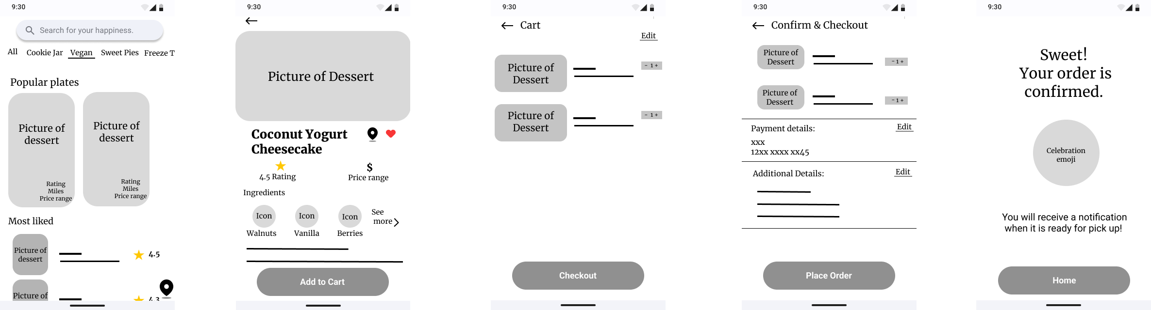
Low-Fidelity wireframe
For the Sweet Tooth project, we developed high-fidelity wireframes using Figma. These wireframes were essential in visualizing the detailed design and functionality of the app. We conducted multiple rounds of usability testing with these wireframes to gather feedback and identify any usability issues. Through three iterations, we refined the design based on user feedback. Our findings highlighted the need for clearer navigation and more intuitive interfaces, which were addressed in the final wireframes to enhance the overall user experience.


Usability Testing: Identifying Issues and Crafting Solutions
Our primary goal for conducting guerrilla usability tests was to observe user interactions with the app in its low-fidelity stage and identify pain points for improvement.
Task
Navigate the search option.
Select the vegan tab and proceed to payment.
Choose a dessert under the craving option and complete checkout.

Issue #1: Distracting the "Create Account" button color
Finding: During usability testing, we identified a significant issue with the search bar functionality. Test subjects frequently expressed confusion about how to use the search bar, with comments like "What should I click? Where am I clicking?" This confusion occurred in multiple tests, indicating a pervasive problem.
Solution: To address this, we redesigned the search bar to be more intuitive. We added clear labels and visual cues to guide users. The design was iterated three times, with each iteration tested for user comprehension. The final design was validated through additional user testing, showing improved user understanding and satisfaction.
Feedback

Users appreciated the clean design of the Vegan Dessert Page.
The overall design was found to be simple, straightforward, and easy to understand.
The design is simple and transitions between actions well.
Positive

Confusion about the search bar usage.
The navigation bar tab goes off the screen.
Inconsistent fonts and spacing.
Inability to exit the search tab without closing the app.
Issues with the "place order" button not progressing to the next screen.
Negative
Based on this feedback, we prioritized making changes requested by the majority to enhance user experience and ensure the app's functionality meets user expectations.
Presentation
Group Work - Collaborative Design Phase
In developing the final design for Sweet Tooth, we followed a fresh and inviting visual style to make the platform engaging and user-friendly. We incorporated feedback from guerrilla testing to make significant improvements, such as adding back and cancel buttons, removing the confusing speed checkout option, and simplifying the home page for better navigation. Our design reflects our understanding of user needs by including features like a visually appealing search bar, a "like" button, a dedicated Vegan section, and an ingredients page for transparency. The personalized "Craving for You" section, based on user search history, further enhanced the user experience by encouraging users to explore new desserts.

Individual Contribution - Final Product Design:
After the team design challenge and completion of the UX/UI course, I decided to further refine the Sweet Tooth app on my own. This allowed me to apply the knowledge gained from the course, as well as from additional learning resources, to enhance the design and elevate the user experience.
I continued with the fresh visual style and adhered to Material Design guidelines, emphasizing improvements in user flow and intuitiveness. In response to user feedback, I incorporated additional refinements to ensure that the final product not only met but exceeded user expectations, ultimately delivering a delightful and seamless dessert discovery experience.

Key Takeaway & Future Projects
The Sweet Tooth project holds a special place in my heart as it addresses a personal challenge I’ve faced. Having managed my blood sugar levels and overcome pre-diabetes, I wanted to create a solution that would allow others to enjoy sweets without compromising their health. This journey has been both personal and professional, driving my passion to refine and enhance the app further.
Next steps
To further enhance the Sweet Tooth app, I would focus on expanding the app's features to include more personalized recommendations based on user preferences and dietary needs. I would also work on integrating social features, allowing users to share their favorite desserts and reviews within the app.
01
Integrate social features and a review system, prioritizing user feedback for design iterations.
02
Establish local business partnerships, offering exclusive deals while maintaining a user-centered approach.
03
Expand the app's reach by catering to a broader range of dietary restrictions and preferences.
04
Incorporate machine learning and stay up-to-date with industry trends to continuously enhance the user experience.
My advice to the next designer is to prioritize user feedback and adaptability in the design process, ensuring that the final product remains user-centered and evolves to meet the needs of its audience. By staying open to collaborations and staying informed about emerging trends and technologies, the app will continue to provide value and innovate in the market.
Growing as a Designer
Throughout the Sweet Tooth project, I developed new skills and refined existing ones:
I honed my abilities in prototyping, wireframing, and using design tools such as Figma and Miro.
I improved my communication and collaboration skills, especially in a team setting.
I learned to navigate design challenges and find innovative solutions to meet user needs.
I effectively managed my time to meet project deadlines and deliver a high-quality product.
As a UX/UI designer, developing the Sweet Tooth app was a fulfilling experience. I learned the importance of customization, active listening to user feedback, and creative problem-solving. The project reinforced my commitment to user-centered design and inspired me to continue creating innovative solutions that cater to users' needs. Sweet Tooth reflects my dedication to balancing health and happiness, empowering users to enjoy desserts guilt-free while adhering to their dietary needs.